Gaza
From 6th Oct 2023 - 8th August 2024: 33,696 Palestinian people were killed, each dot is someone who was killed.
Published on September 1, 2024
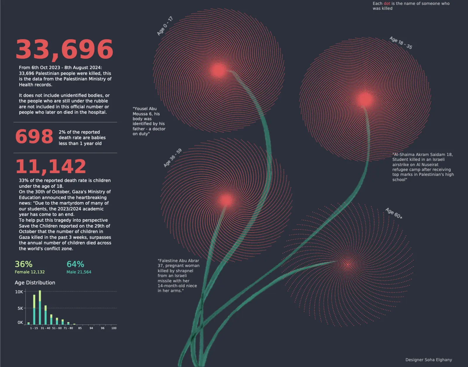
From 6th Oct 2023 - 8th August 2024: 33,696 Palestinian people were killed, each dot is someone who was killed.
Published on September 1, 2024
Covid. Climate. Cost of living. Ukraine. Gaza. The words “polycrisis” and “permacrisis” have entered the English language to describe multiple, ongoing crises. When numbers become unfathomable, how can data be used effectively yet ethically? Psychologist and data visualisation artist Soha Elghany shares her insights.
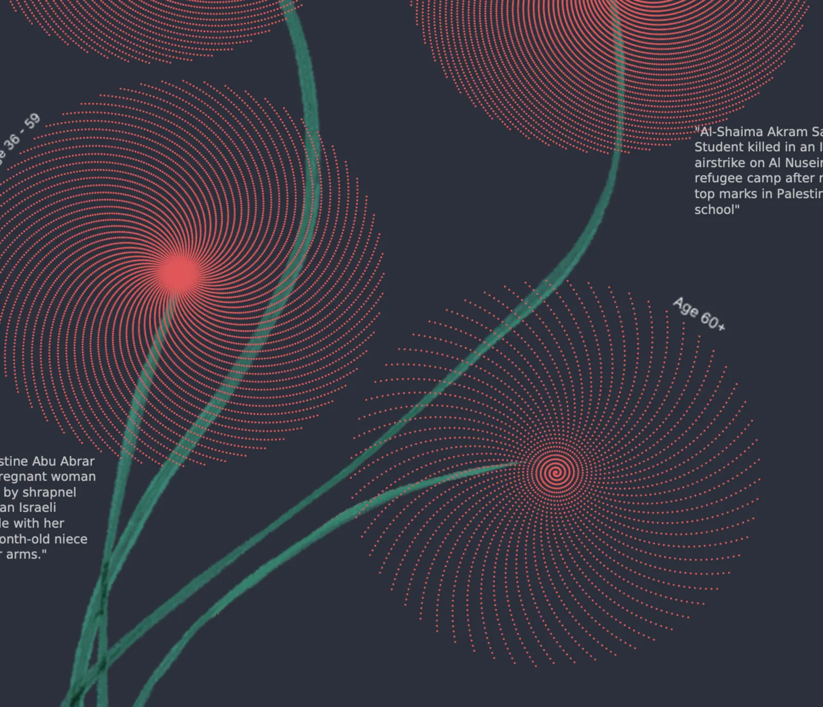
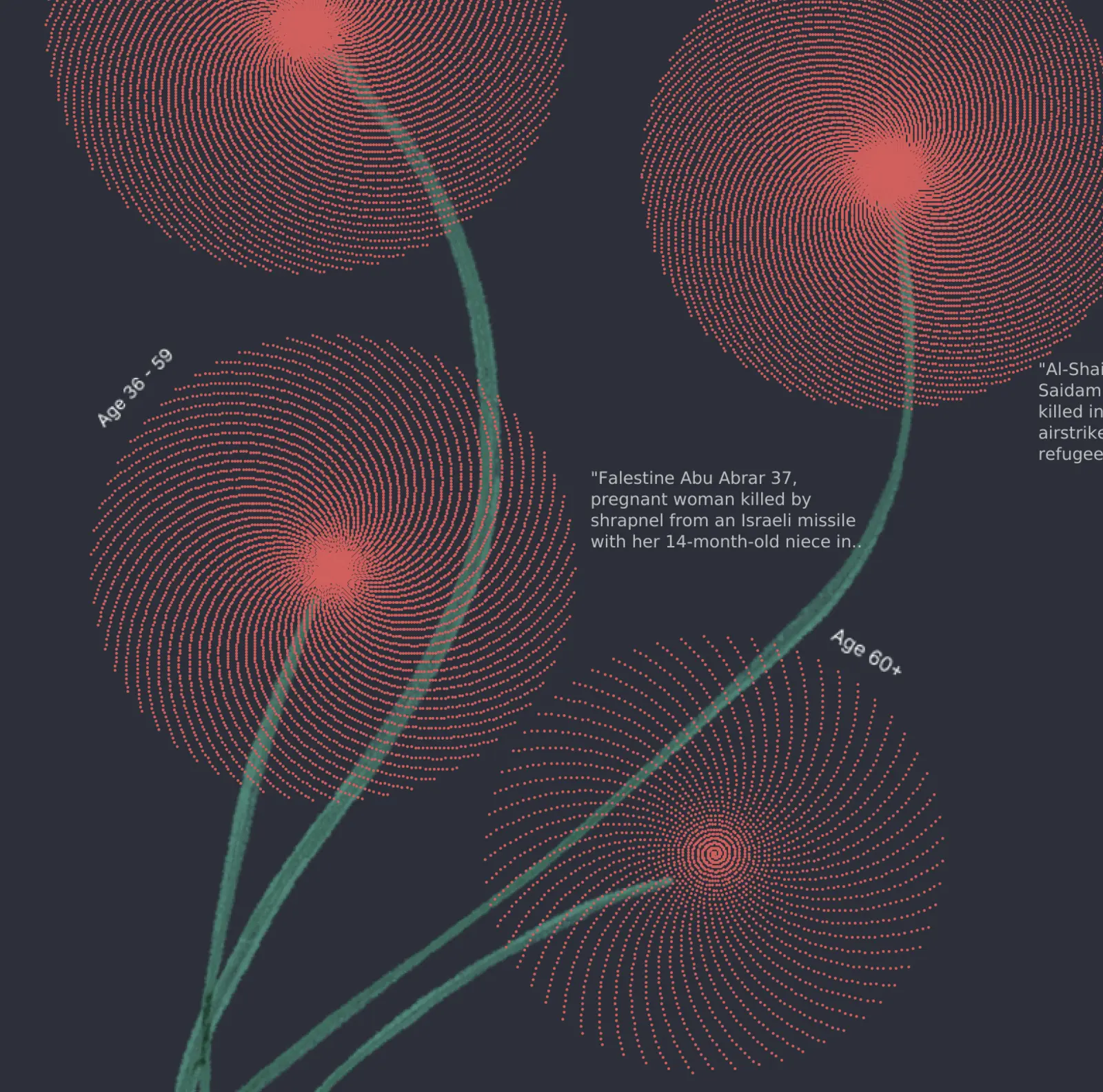
In November 2023, Soha visualised the Palestinian death toll over a 20-day period. Large numbers like 580,000 lack meaning, causing “compassion fade” or “psychic numbing” — our brains cannot empathise with statistics alone. Each number represents a life, and ethical visualisation must humanise the data.
Soha’s solution was disaggregation: each dot represents an individual, with hover revealing name, age, and gender. The poppy motif, a national symbol, marks the data visually, emphasising children’s deaths and highlighting age brackets.
Ethical considerations guided her design. Data collection, missing data, and biases were all examined to prevent misrepresentation. The aim was to focus on people, not just numbers, ensuring visualisations create empathy rather than desensitisation.
Humanising numbers: each dot represents a life lost, giving meaning to data from Gaza.