In 2022, Soha Elghany visualised data from the Missing Migrants Project, which tracks lives lost along migration routes. Each death is more than a statistic; it represents a human life, a story of hope, fear, and displacement.
Large numbers in migration data can desensitise audiences. To counter this, Soha chose a disaggregated approach: every dot represents a person, and hovering reveals age, gender, and location. This design ensures empathy remains at the forefront.
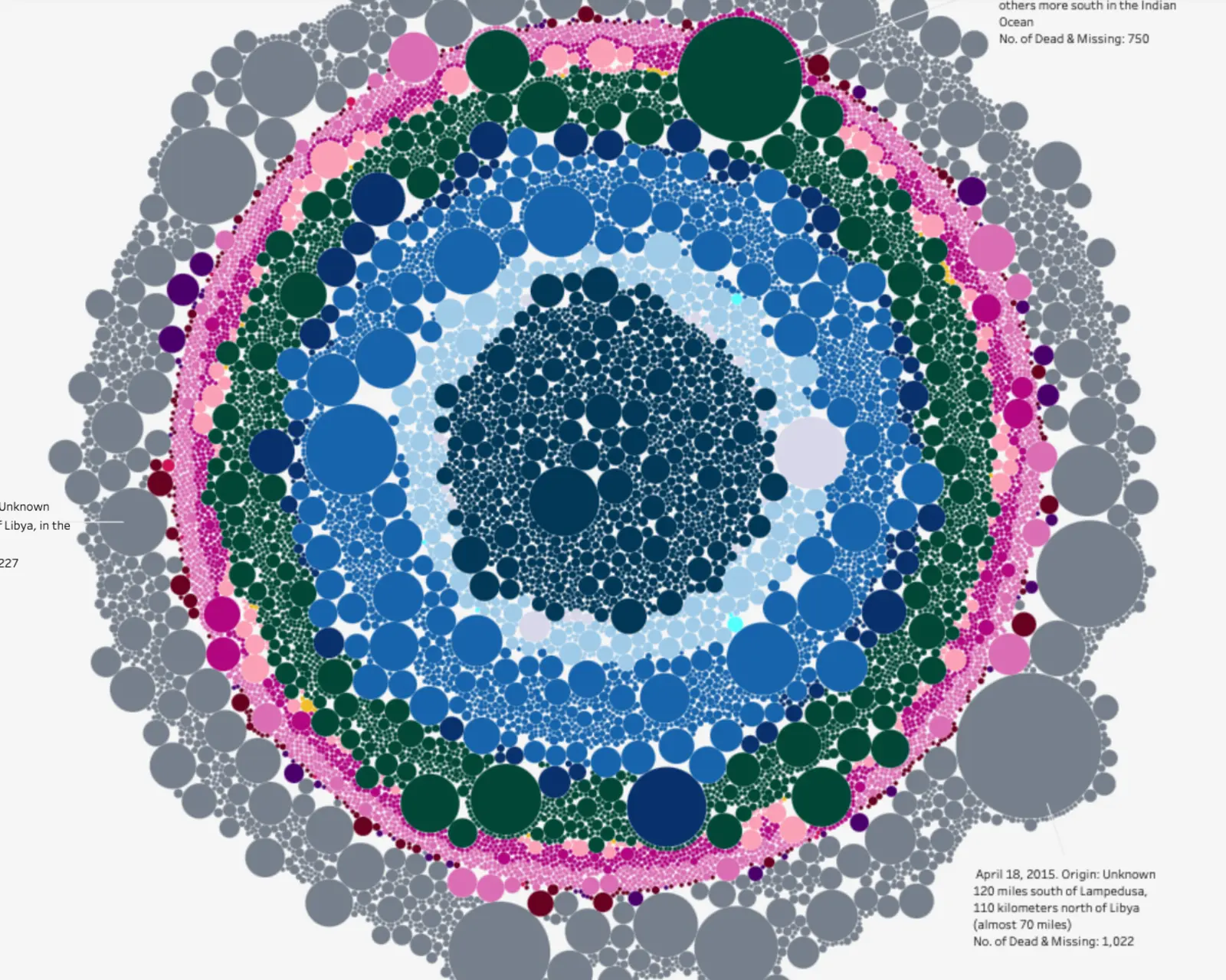
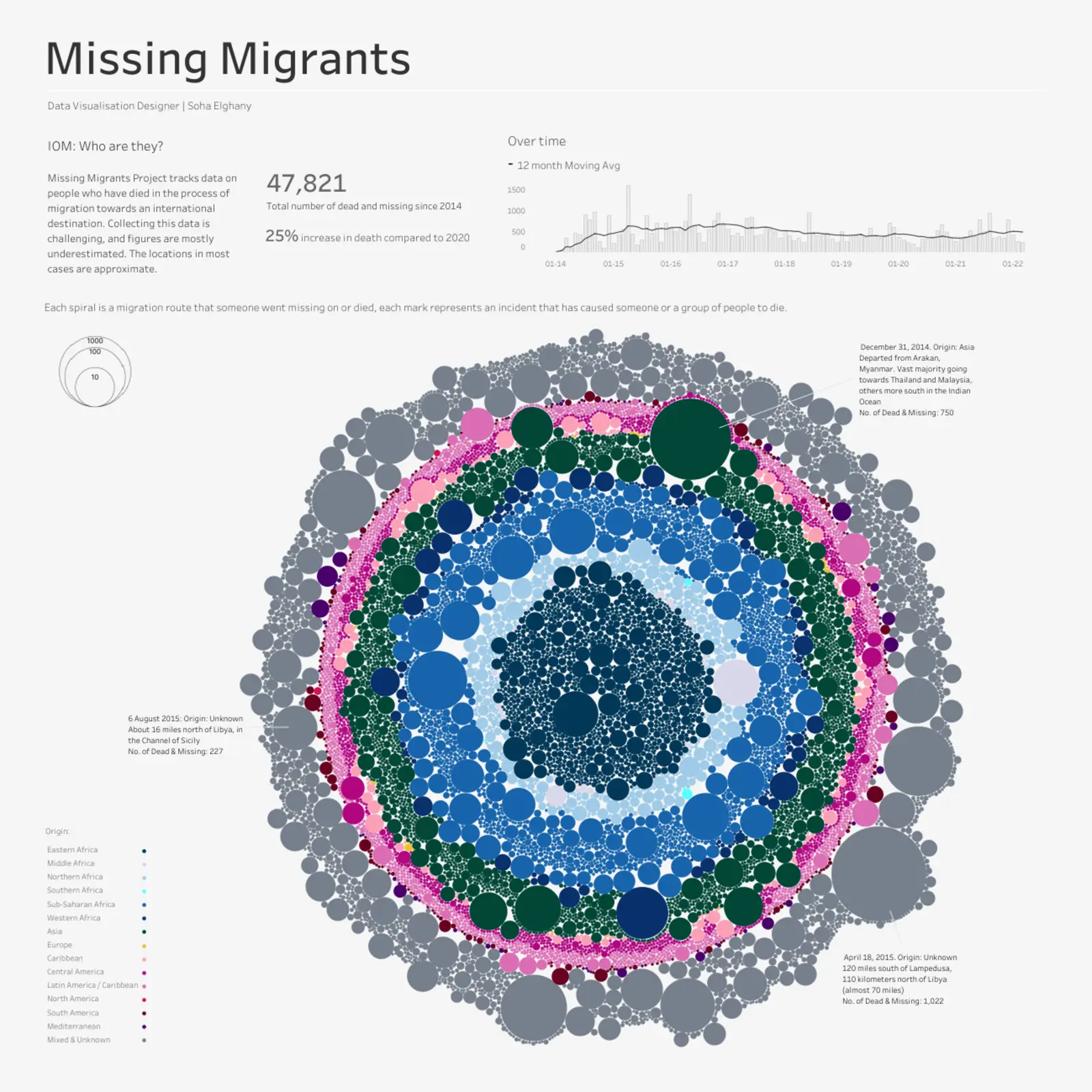
The Missing Migrants Project tracks people who died or went missing during migration toward international destinations. Each spiral represents a migration route, and each mark along it corresponds to an individual incident.
Ethical considerations were central. Data collection processes, gaps, and biases were carefully analysed to avoid misrepresentation. The goal was to focus on human lives rather than mere numbers.
Visual motifs and colour choices were designed to convey the gravity of loss while maintaining clarity. Age groups, gender, and geographic patterns are all highlighted to give viewers a deeper understanding of the global migration crisis.